Role
Timeline
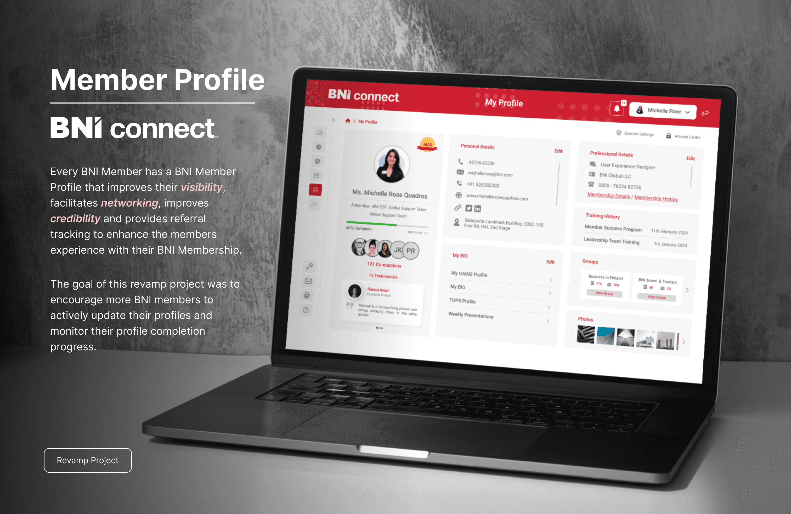
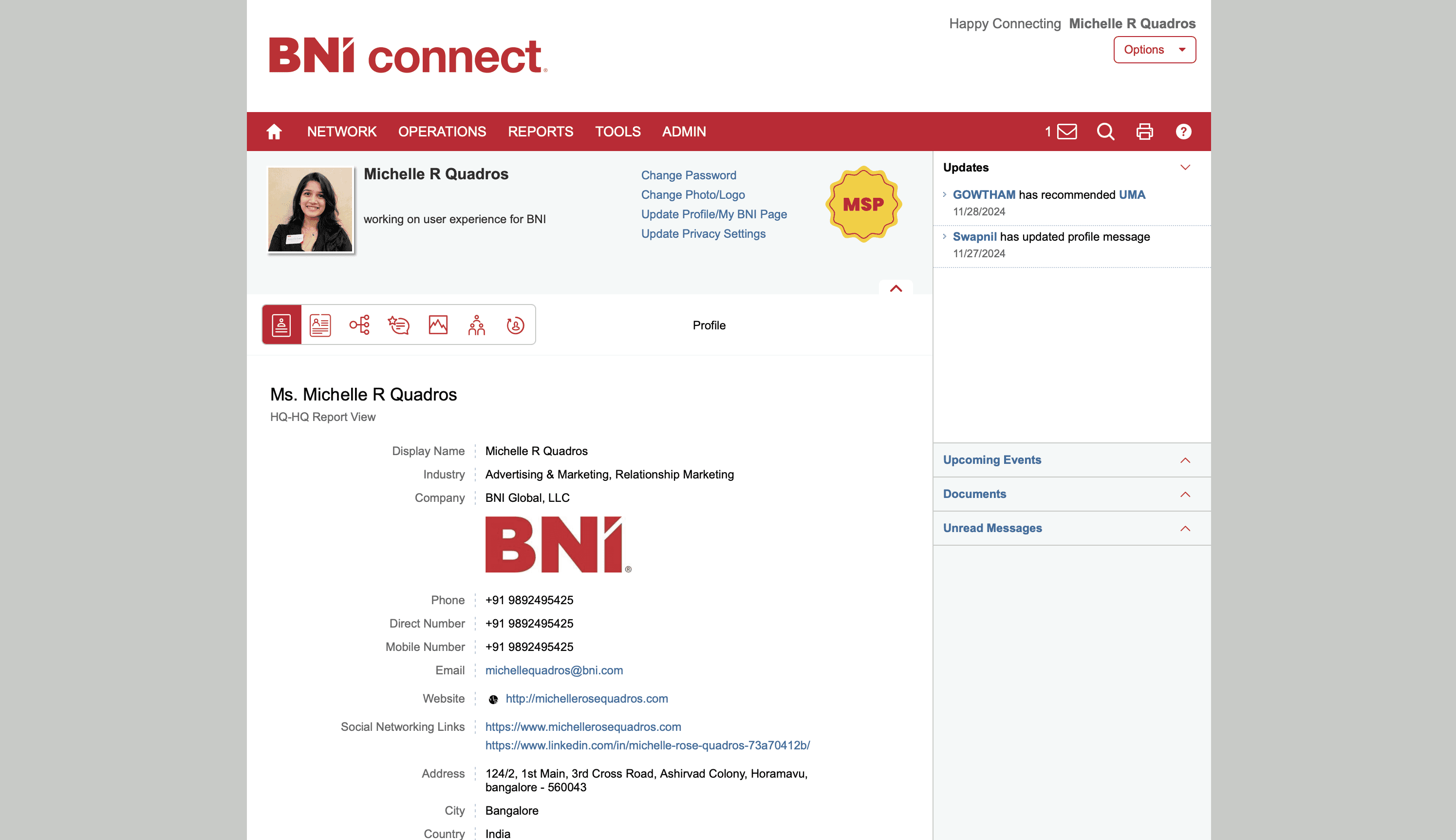
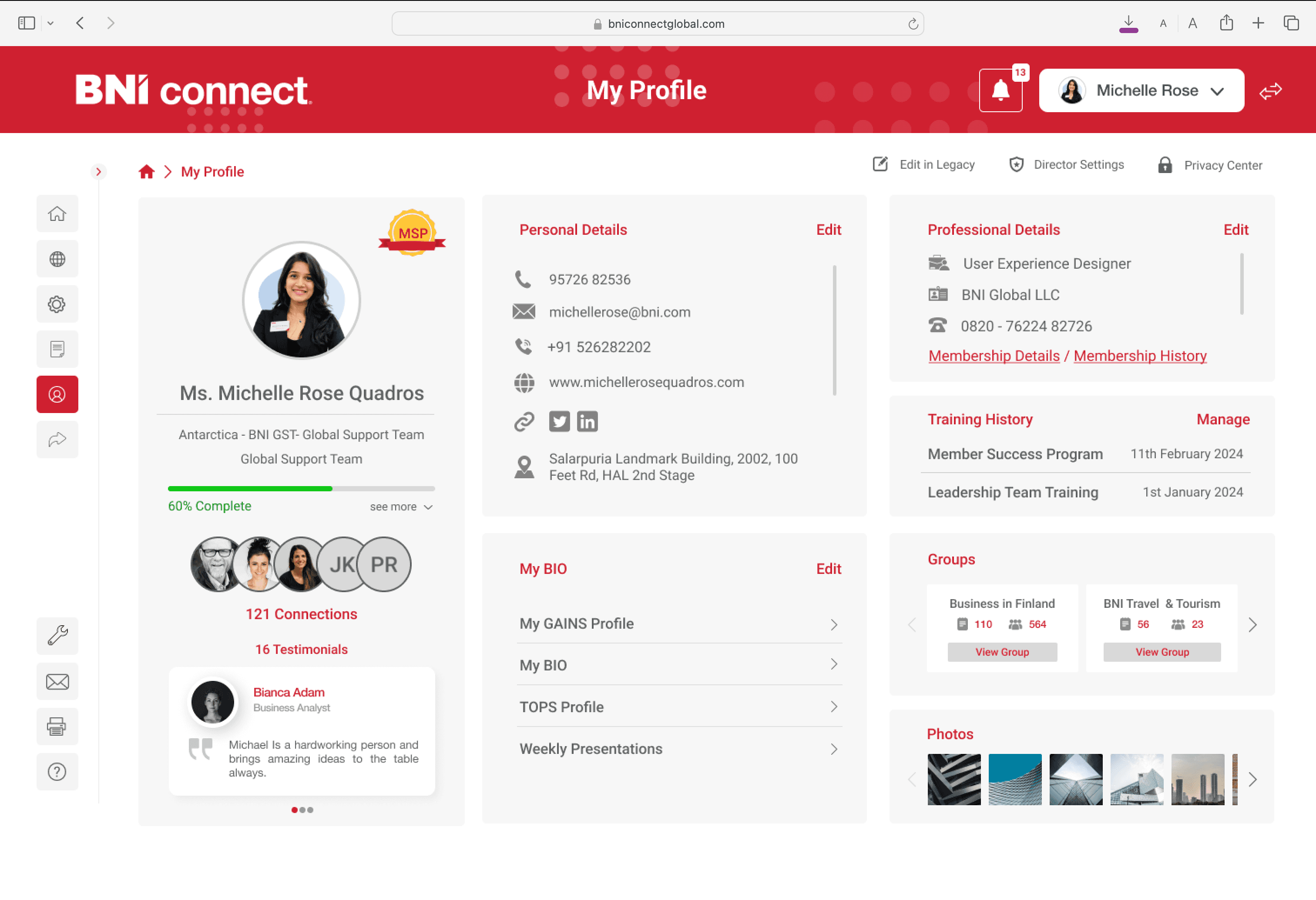
PS. This is an interactive slider to showcase the design before and after the revamp

🤮 Congested Tab Design
The current tab design doesn’t emphasize key aspects of the member's profile. Members should be able to quickly scan and gain a clear understanding at a glance.
🔔 Notifications lacking organisation
The users would prefer having updates and unread messages consolidated in one place, without taking up too much space.
🙈 Essential tabs buried in the interface
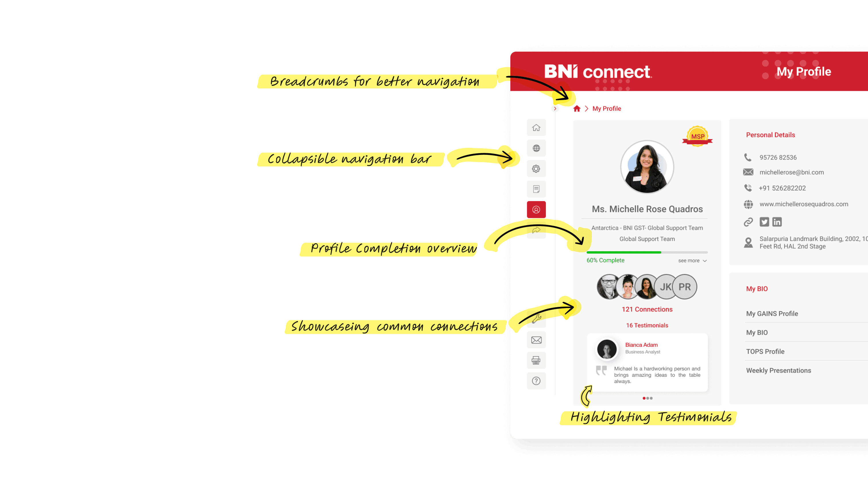
Displaying testimonials enhances members' credibility and attracts more leads. These tabs should be prominently highlighted.


⛔️ Inconsistent Tab Labelling
To boost networking on the platform, the member profile should be visually engaging and encourage users to explore each section thoroughly.
Wireframing and Brainstorming
How Might We?
Dedicated Hero Section
A professional photo with member details to highlight the important details of the member.
Mutual Connections
Viewing mutual connections on a member's profile can be a powerful motivator to connect because it provides a sense of familiarity and trust.
Visual Testimonials
Received testimonials should be prominently highlighted to build credibility and trust, making it easier to gain referrals.
Active Groups Displayed
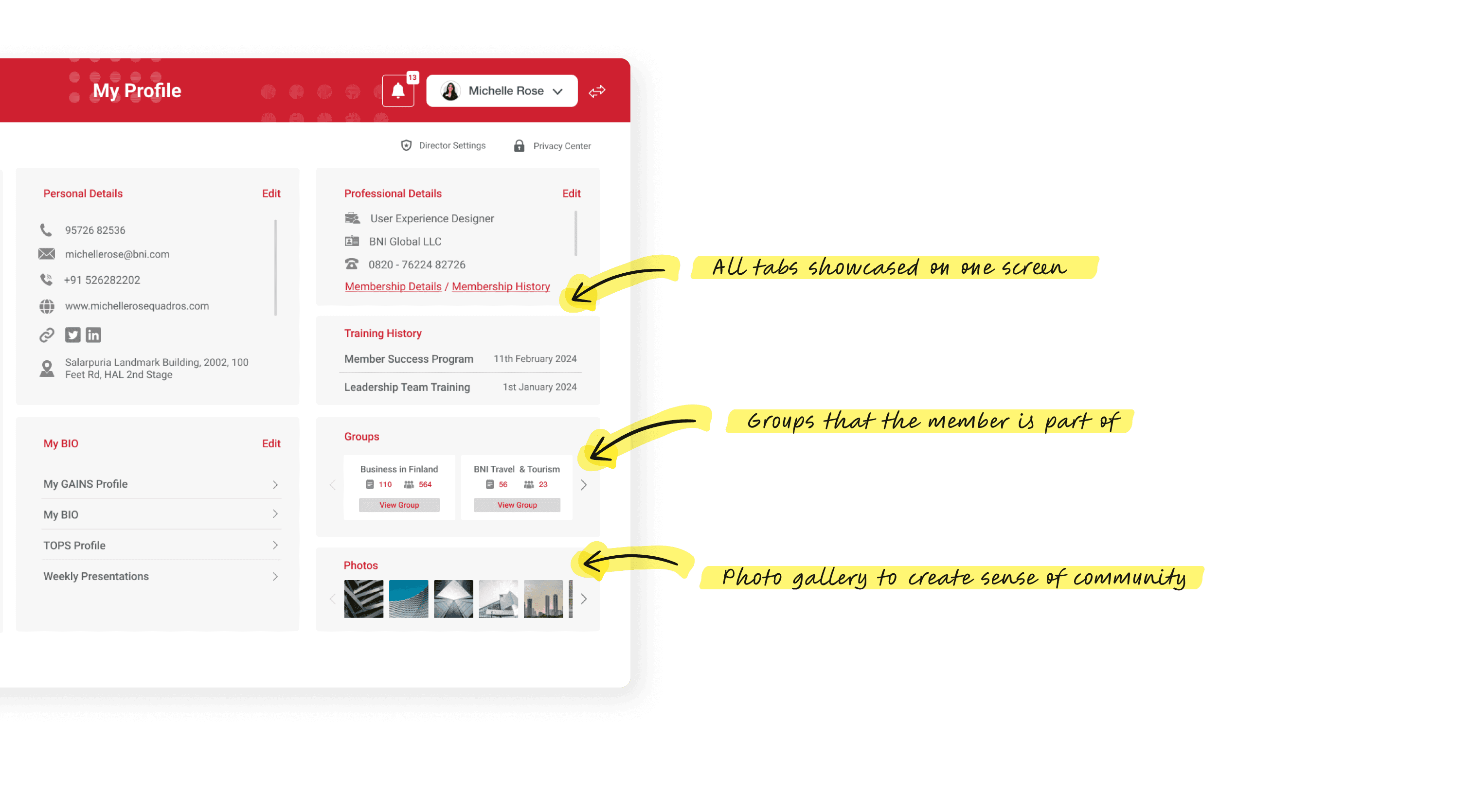
When someone sees you're part of relevant groups, it signals a potential common ground and a similar commitment to those topics or industries.
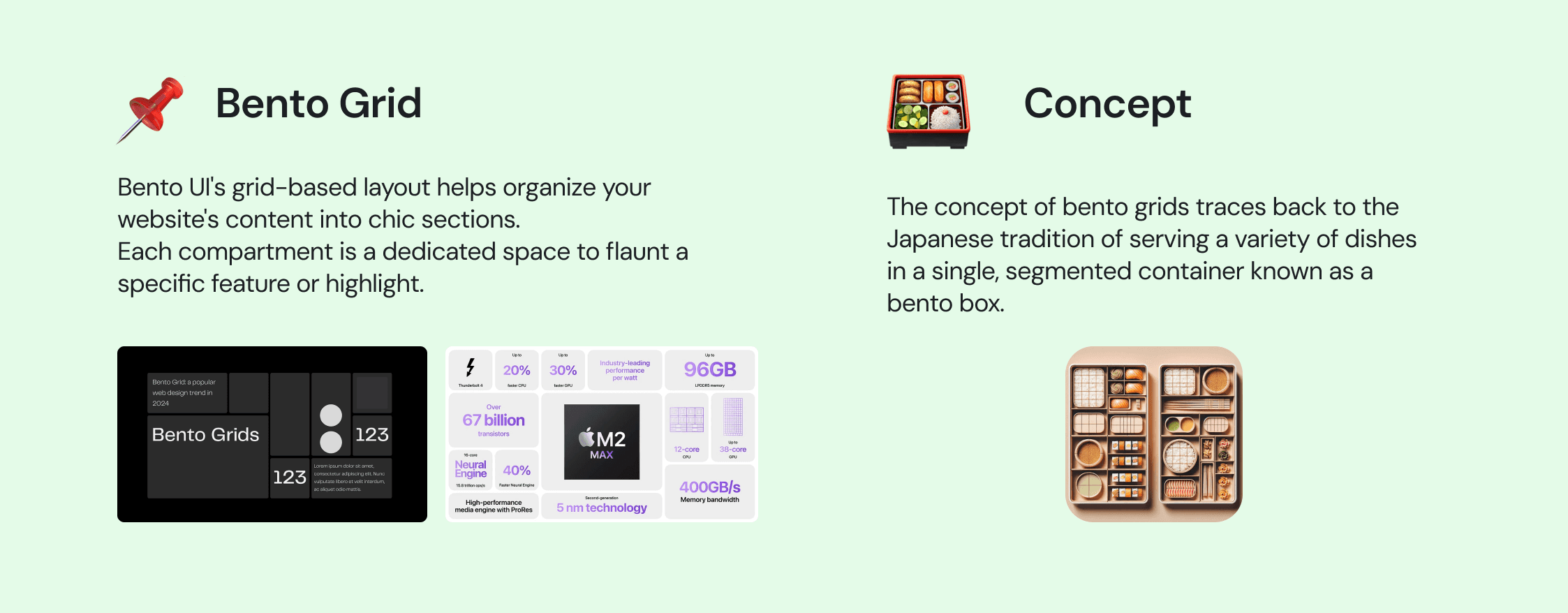
Bento Grid Layout
This grid based layout helps organise the profile, each compartment into a dedicated space to flaunt a specific feature.
Profile Completion Metrics
This gamified approach not only taps into users’ desire for completion but also highlights the value of a detailed profile in maximizing visibility and networking opportunities, prompting members to invest more in showcasing their expertise and interests.
[I find this amusing]
